

Web Design, Implementation, Support
- WordPress / WordPress Full Site Editing (Gutenberg) Blocks
- Responsive Web Design
- Troubleshooting & Transitioning: can’t update your site?
- Analytics
WordPress Blocks / Gutenberg / FSE: Full Site Editing
Recently WordPress embarked on a significant transition to a new site-building environment using “blocks”. (When they embarked they called the new framework Gutenberg, but later changed it to Full Site Editing or FSE for short. In all cases the essence was Blocks as all elements are contained in blocks. So, confusingly, you may see or hear different people use Gutenberg, Full Site Editing, FSE or Blocks as the name for the new framework.) This transition has extended over the past few years, with ongoing updates and improvements. At this time existing websites built using “classic” themes will continue to work, but we are now building new websites in the FSE Blocks environment.
We can also transition your site from the Classic environment to the new FSE framework.
Why Transition to Blocks?
WordPress remains backwards-compatible with classic PHP-based themes for now, which is good. Many theme-builders are now making their themes “blocks-compatible” which straddles the space between the Classic environment and the new Full Site Editing framework.
WordPress FSE/Blocks is essentially a native page and template builder. It allows builders to create layouts and apply styles to pages and posts using “blocks”, negating the need for page-building plugins or bloated themes. Transitioning enables your site to work with the latest version of PHP, increasing security and speed.
You can transition one of two ways:
- Move or update to a Classic but Blocks-compatible theme and re-layout page and post content using Blocks, or
- Move to a Full Site Editing Theme, create header, navigation and footer, and re-layout page and post content using Blocks.
The difference between Classic and FSE themes is that with FSE themes you build the headers (with navigation) and footers yourself, within the Editor. You may also build or modify page and post templates. With Classic themes you use (usually with the ability to customize to some degree) the headers, navigation, footers and page and post templates that come with the theme; changing them requires programming skills.
FSE themes, like Classic themes, can be selected for the way they look. You can use their templates with or without modifications. The difference is that with FSE themes you can modify templates or create your own, inside the Editor.
On the other hand, with a Classic theme you may like a sophisticated navigation, header, footer or template layout. For now you can have it both ways: we can use a Classic theme you like while laying out content on pages or posts using blocks.
Call us to learn more about WordPress Blocks and the best approach for your site.
Responsive WordPress Sites
At TH Design, we develop and build responsive websites in the WordPress platform. WordPress has an extensive user base, a massive support database and active support community.
WordPress offers literally thousands of plugins that extend site functionalities, such as:
- Slideshows/Carousels and Photo Galleries
- Newsletter Sign-ups and Management
- Video/Audio Players
- Members-Only Portals
- Events Calendars/Registration
- Testimonials
and many, many more!
With WordPress, it’s possible to sync your Social Media communications channels with the website thereby eliminating a lot of redundant posting, tweeting, etc.
And, WordPress makes it possible to incorporate a blog into a website while maintaining consistent visual branding.
Content Management System
Edit your pages via your internet-connected browser, anywhere!
WordPress has a built-in Content Management System that enables “permitted” users to access the site via any web browser and make page updates and changes. (You can access your site through a password-protected portal via any internet-connected browser—even your smartphone!) Different levels of permission can be assigned giving some users full ability to make changes and other users more limited access. When multiple people need to be able to make site updates, WordPress delivers!
Troubleshooting: Having problems with your existing WordPress website?
WordPress sites and blogs are robust and can be long-lasting. But sometimes that means the original builder isn’t available and the site owner can’t fix a problem. One of the beauties of WordPress is it’s extensibility, but that can lead to complexities. If you’re having problems with a site or plugin, call us!
“Thank you for the great job in creating our new website. We love that we can update our site anywhere on any computer-either Windows or Mac…”
Ruth Kaser, RD Bike Shop
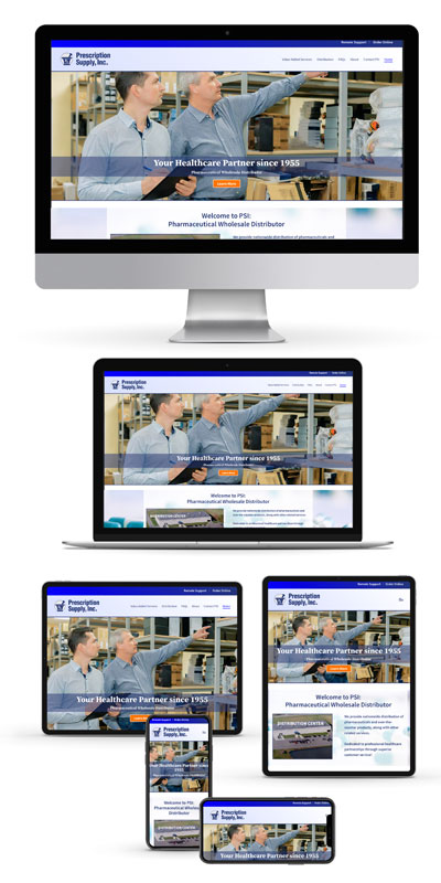
Responsive Web Design
You can visit a “non-responsive” website on a smartphone — it will usually appear miniaturized and to navigate around the site you have to swipe and zoom a lot but it can be done. The difference with a responsive site is that when you arrive on your smartphone (or a smaller tablet) the site will appear “full size”, with instantly readable text and larger buttons, and scrolling will only be up and down instead of right to left AND up and down. A responsive website doesn’t shrink to fit in a smaller device, it rearranges to fit. Content that displays in multiple columns on a large monitor will reflow to display in a single column on a smartphone or small tablet.
Tablets come in a large array of sizes and change from wide and short to tall and narrow (some are more square). We build sites to be able to reflow from three/four columns to two, then down to one. Your tablet may display pages in any of those configurations depending on the specific viewport’s dimensions and orientation,
The great thing is: One Website, All Devices. You can deploy and support a single website and have it work on a full range of sizes, negating the need for separate desktop and mobile websites.
Pay Attention to Text Section Widths
Super-wide text blocks are now common on wide screens and are difficult to read. People can read text comfortably in blocks up to about 750 pixels in width. Stretch wider and the eye starts having trouble knowing where the next line is and easily skips lines, causing confusion. Wide headlines with large letters are readable but not information-packed text blocks. At TH we make sure to layout text in columns or smaller containers to avoid this problem.
We work to make your site content readable for all device sizes!
Google recommends “Responsive”
“Using responsive web design has multiple advantages, including:
- It keeps your desktop and mobile content on a single URL, which is easier for your users to interact with, share, and link to and for Google’s algorithms to assign the indexing properties to your content.
- Google can discover your content more efficiently as we wouldn’t need to crawl a page with the different Googlebot user agents to retrieve and index all the content.”
Web Analytics
Web Analytics is the phrase used to encapsulate the interpretation of data collected by the servers where websites reside. As more and more businesses seek to develop a greater presence on the web, it has become increasingly important—particularly for businesses engaged in e-commerce—activities to get specific answers to some basic questions:
- How many visits does the site log on a yearly, monthly, weekly, daily or hourly basis?
- From where did the traffic originate?
- How long does the typical visitor stay at the site?
- Are visitors viewing pages where critical information resides?
- What’s the number of visitors to sales generated ratio? (the conversion rate.)
With this type of data, working in conjunction with an informed web development/design team, you can tailor your site to work in concert with all of your marketing efforts.
There are several Web Analytics programs available. We can recommend, implement, and manage a program for you, or teach you how to use one.
Website Speed
A number of factors affect web page load time, including but not limited to:
- number and “weight” of images/graphics (i.e. have the photos/images been optimized?);
- complexity/quantity of CSS stylesheets and scripts;
- references to external resources (such as Google Fonts, external javascript/jquery libraries, etc.);
- use of external resources (does your video play on your server or at YouTube?);
- the number of http requests required to load the page.
(Http requests happen each time your computer/device asks the server to send it the pieces/parts that make up the web page. Each graphic, photo, script, stylesheet, chunk of html, video, audio file etc. generates an http request.)
There are several techniques that can be used to reduce the number of http requests and speed up the load time of photos/graphics. The nature of the website and the site’s content will dictate which techniques are best for that site and where trade-offs are required. These considerations are built-in components of our process when designing and building websites at TH Design.
The ideal website, from the point of view of load-speed and easy Google spider crawling, would have nothing but text. Visual elements, animation, audio/video etc. slow sites down but also make them more interesting and functional. So if you test your website and don’t score 100% across all metrics don’t despair! Go for a high score and know that improvements are possible. Call us if you need help!
Hosting
We do not host websites on our own servers. However, we are affiliated with Bluehost, a hosting service provider.
Bluehost offers an exceptional level of service for excellent prices. Click here to sign-up with Bluehost now.
Most hosting companies offer similar services so we’ll ask you to switch hosts only if a needed service isn’t provided through your current host.
Support
If we build a website for you we will support it. We will monitor it, respond if you run into problems, answer questions if you forget how to do something, make structural changes as your needs change, and add functionality as your traffic grows.