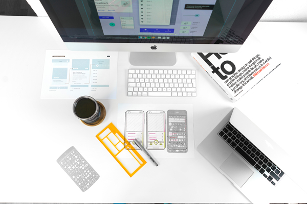
A responsive website moves through multiple layouts, which means the designer/developer has to start by conceptualizing the different layouts — how will the pages look as they go from large to small or small to large?
To do that you have to start with a “default” design and the initial question is: which design comes first, the small (mobile) or the large (desktop)? There’s a robust debate raging in the web development community over that very issue.
The “mobile-first” adherents basically believe that starting with the smallest perspective forces people to think hard about what content is really necessary versus “fluff”. When your mindset is directed to the mobile experience you tend to weed out, pare down, and focus, resulting in a cleaner, simpler website with tighter content and less clutter.
The “desktop-first” crowd are not operating from a philosophical point of view so much as a “this is what I’m used to” perspective. The desktop version of a site is generally much more complicated, and includes more flourishes. It’s the site at its “peak”, the “best” version of the site.
I’m still chewing on the “which comes first” question.
From a coding standpoint, I have found it makes more sense to start large and go smaller. This is because more complex layouts require more “divs”. (From W3C: The “div” tag defines a division or a section in an HTML document. The “div” tag is used to group block-elements to format them with styles.) Moving from large to small is the process of manipulating those divs. For me, it is easier to simplify the design code as I move from multiple columns to one column than it is to take the simpler code and ratchet it up.
Either way, working out designs and making decisions about HTML source order has to take place within a larger context than previously as one must factor in the layout changes that will be required. I typically write the CSS for the desktop first, then for a tablet/middle size version(s), then for a mobile/small version. Moving from large to the middle and middle to small involves several re-visits and modifications to the large and middle stylesheets as issues arise in each new context. This has also meant that the designs themselves usually require minor alterations for better implementation.
Now, once the CSS is pretty much nailed down I’m in full agreement that the mobile styles should come first in the stylesheet or otherwise be the “default” styles, with the more complex variations kicking in via media queries. This ensures that small devices load the simplest, fastest-loading version of the styles. The only real drawback to making the mobiles styles the default is that Internet Explorer 8 doesn’t process media queries — it will use whatever styles come first, i.e. the mobile styles. So there has to be a separate IE8 stylesheet (IE9 and up are fine with media queries).
Client after client has expressed a desire for a “clean design” and decried sites that are cluttered and visually overwhelming. Maybe we’ve peaked on the “shovel every nifty thing you can” into websites and are heading into an period of simplification. Certainly “responsive design” demands a more critical assessment of both content and ways of displaying/conveying content than has been necessary in the desktop-is-king era.


