
Although web designers have been buzzing about Responsive Design for the last year or so, “laypeople” are just starting to hear the phrase and are not at all clear about what it means.
Broadly speaking, responsive design is a group of techniques, which, combined, result in websites that can respond to the dimensions of the device they are being viewed through. This new approach relies on the use of “media queries”, which is a kind of coding that can be written right into a Cascading Stylesheet, and which can cause different style rules to be applied to a web page based on the screen size of the viewing device (and/or other factors such as pixel depth, orientation, and more).
When new elements/advances of HTML or CSS are released to the world, browsers have to update in order to be able to “use” them. Browsers adapt on their own timelines and in their own ways, so there is always a lag time between a release of something and widespread use of it. But by mid 2010 there was enough browser acceptance for media queries to start being used, and in May of 2010, Ethan Marcotte wrote an article in A List Apart, which coined the term “responsive design” and ignited a web design revolution.
Previously the vast difference between a 220 px phone screen (through tablets and iPads) to 1800px and wider monitors, was so great that it didn’t seem possible or reasonable for the same website to be visited by such range of devices. So a lot of companies and organizations chose to deploy a mobile version of their website in addition to their desktop version, and some outfits with money to burn created even more versions to fit popular tablet sizes, or different sizes of phones. But that approach is expensive, hard to keep up with, and never ending.
With widespread browser acceptance of media queries, a new approach was now theoretically possible, and Ethan Marcotte’s article laid the groundwork for this new approach.
Note, media queries are only the starting point for responsive design. Several other elements are required to make it work well, especially with complex designs. In later posts I will discuss some of these elements, but for now the point is that we can now build one website and have it work in multiple sizes.
What do I mean by “work”?
Currently, any well-constructed website will appear in a smartphone or Nook or iPad looking just like it looks on a desktop, except it will be shrunk-to-fit. Since desktop sized websites typically have multiple columns and plenty of content, it doesn’t take much shrinking to make a site hard-to-read or unreadable. So smartphones and pads all have zooming and scrolling/swiping capabilities which enable you to enlarge content and scroll sideways to be able to read text. But it get’s tiresome to have to constantly move the page and people on mobiles quickly abandon sites that require endless sliding side to side.
Furthermore desktop designs often employ advanced features that don’t translate well or sometimes at all to mobile platforms. Slideshows meant to be seen in full lose their punch when you have to slide back and forth, for example. Features and entire websites built in Flash don’t show up on the iPad at all. (Apple’s decision to not support Flash caused an earthquake in the web design world.)
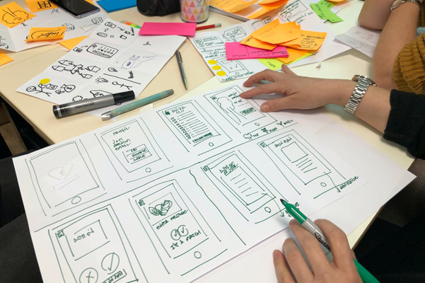
With a responsive approach you actually design a small, medium, large and sometimes extra-large layout of your site, planning style changes for these sizes, then you combine all the designs into your stylesheet(s) and use media queries to tell the device which design to use. So a smartphone will use your “small” design; a tablet will use your “medium” design, a desktop will use your “large” design, and a 25 inch monitor will use your “extra-large” design. (Frankly there hasn’t been all that much work done on the extra-large side of things yet as they’re in the minority. Way more people are using small devices.) The typical path is a narrow single column layout for phones; a wider single/double column layout for tablets, then as many columns as you want for the larger sizes. The key lies in planning the html order so that your content can move through these sizes seamlessly. (There’s a bunch more that gets done which I’ll elaborate on later but my focus here is what the visitor will experience when they visit a responsive site.)
Thus, when you go to a site on a smartphone, the page is completely readable immediately. You will have to scroll down, but you won’t have to scroll laterally. The typesize is comfortable, the navigation links are easy to use with fingers and thumbs, and various measures will have been employed to make it easy to move around through the site. The site will feel like it had been built for the smartphone.
You could visit the same site on a tablet and the layout will be slightly different. It may be somewhat more elaborate, but once again, it will feel right, like it had been designed just for that tablet.
Visit it again on your desktop or laptop and you’ll see a multi-column design that looks entirely at home in it’s larger space.
What About Updating A Responsive Site?”
Since we build our sites in WordPress our clients have a content management system that enables them to login through a browser and do site updates. The beauty of the responsive design approach is that you still only need to do one update to a page and it will work on all sizes. No more having to keep up with multiple sites!
Meanwhile you can feel good that your site is mobile friendly, for that ever-growing group of mobile surfers. (Contrary to previous conventional wisdom, people are now using their phones to surf sites, ie. they are using phones just like desktops and that trend is accelerating. Many people mistakenly assume they don’t get mobile traffic on their websites.)